Projects Overview
SubscriptionPro is a SaaS-management marketplace that enables businesses to discover, buy and manage all their software subscriptions in a single dashboard, while enjoying recurring discounts and streamlined payment flows.
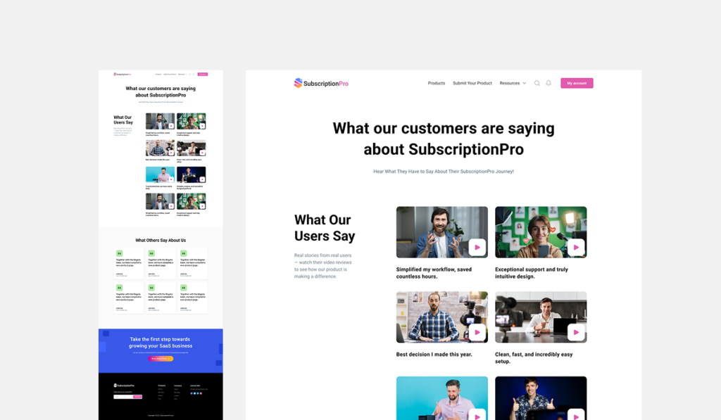
Our agency was engaged to redesign and build their website to reflect their innovative service model and make the user journey smoother and more compelling.
Objectives
- To clearly communicate SubscriptionPro’s value proposition: centralised SaaS procurement + recurring savings + dashboard control.
- To design a modern, clean website interface that resonates with tech-savvy business users and decision-makers.
- To build an intuitive user experience guiding visitors through: “Discover tools” → “See savings” → “Join marketplace/manage subscriptions”.
- To support business goals such as increased sign-ups, longer user engagement, improved conversion from visitor to user.
- To ensure mobile-responsive performance and future scalability (for expanding tool catalogue, enterprise features, global reach).
Requirements
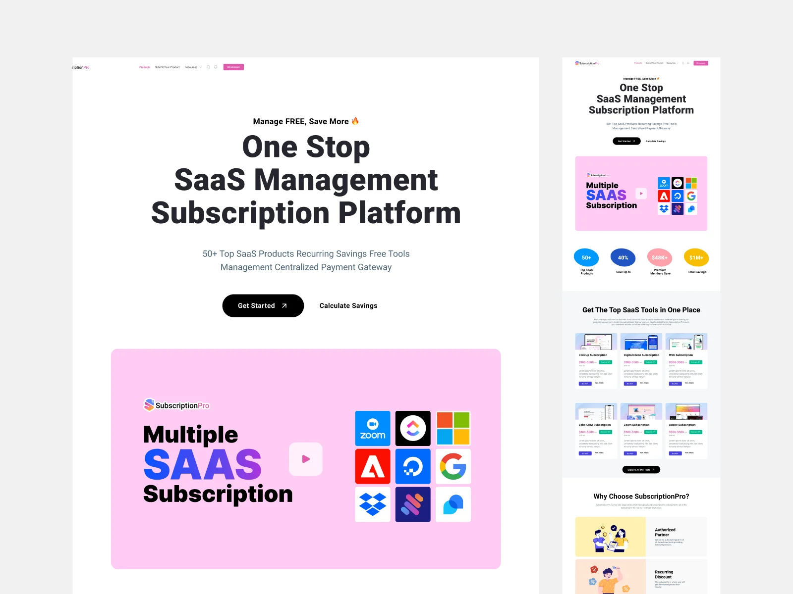
- Homepage that clearly introduces the proposition: “One Stop SaaS Platform” + key statistics (e.g., “60+ tools”, “40% save up to”, “$2M+ savings”).
- Feature pages for core service aspects: authorised partner status, recurring discount mechanism, centralised management system, payments & invoicing, referral/affiliate programme.
- A tool catalogue or marketplace section listing individual SaaS products with savings data.
- Strong CTAs (e.g., “Get Started”, “Calculate Savings”, “Try for Free”).
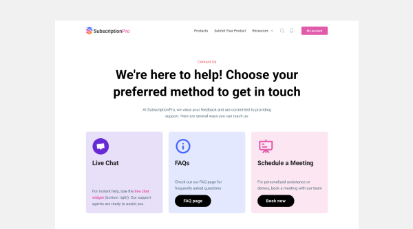
- Responsive design across desktop/tablet/mobile, fast load speed, accessible navigation.
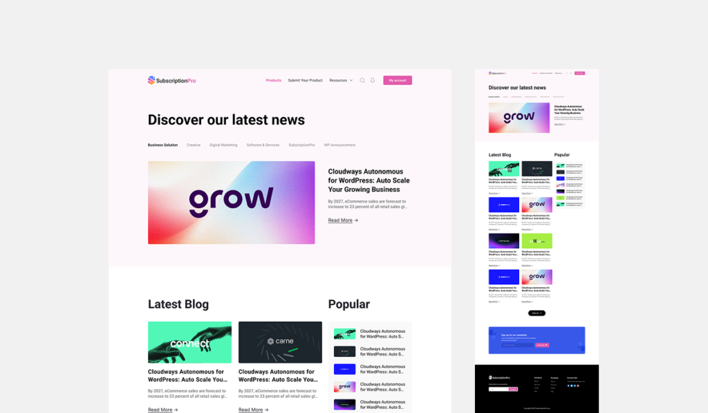
- Visual identity that aligns with the brand’s tech & business-oriented positioning: professional, modern, clean.
- Scalable site architecture to accommodate future growth: more products, deeper dashboard integration, multilingual or international expansion.
Problem
Before this redesign, SubscriptionPro’s website did not fully convey the breadth and depth of its offering. The messaging around “saving on SaaS tools” and “managing all subscriptions centrally” lacked strong visual and UX support. The tool catalogue and savings model were not presented in a way that quickly engages the visitor and converts them into a user. As a result, there was a risk of lower user-conversion rates, weaker brand differentiation, and less clarity around key benefits.
Solutions
- We began with a UX audit and stakeholder interviews to map out the primary user personas: small-/medium-sized business owners, IT procurement managers, and startup founders.
- Developed an information architecture that places the value proposition front and centre: statistics (“60+ tools”, “40% save up to”, “$2M+ savings”) on homepage, clear sections for features and benefits.
- Created a visual design system: clean typography, tech-oriented colour palette, iconography highlighting savings, tools and management.
- Designed a modular “tool catalogue” UI component where users can browse SaaS products, see official vs discounted prices, and click through to buy or learn more — making savings tangible and compelling.
- Built clear feature pages that highlight key differentiators: authorised partner status, recurring discount model, centralized dashboard, flexible payments. Each page carries specific messaging and imagery to build trust and clarity.
- Implemented responsive and performance-optimized frontend so that the website loads quickly across devices and supports smooth user journeys from discovery → conversion.
- Integrated strong CTAs and conversion paths: “Calculate Savings” tool, “Get Started”, customer testimonials to reinforce credibility.
- Structured the website backend so that future growth (adding new tools, new categories, global pricing, localisation) is easily facilitated.