Projects Overview
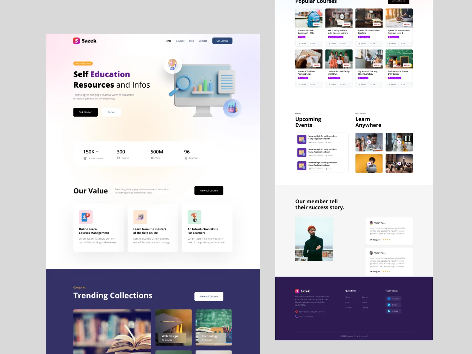
Osam Education is a self-learning resource platform that provides knowledge, insights, and educational content for learners seeking personal growth and skill development. Their vision revolves around the idea that technology is transforming how people learn, and individuals now have endless opportunities to acquire new skills through accessible digital resources.
Doovisual was responsible for designing a modern, user-friendly website that communicates Osam’s mission, organizes educational content clearly, and supports users in exploring learning materials in a structured way.

Objectives
- Build a clean and intuitive website that highlights Osam’s purpose as a self-education resource hub.
- Present educational content in a visually appealing and accessible manner.
- Create a simplified browsing experience where users can easily explore topics and learning categories.
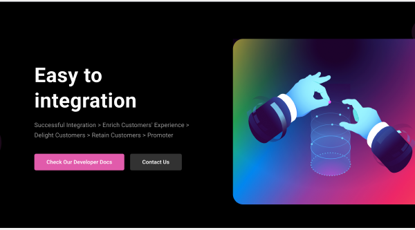
- Establish a strong brand identity aligned with innovation, digital learning, and personal development.
- Increase user engagement through better content layout, improved navigation, and strong call-to-action placements.
- Ensure the website is future-ready for adding more learning categories, articles, tools, and digital resources.
Requirements
- A modern homepage that communicates Osam’s mission: technology-driven learning, self-education, and accessible resources.
- Topic-based content sections allowing users to explore different educational areas.
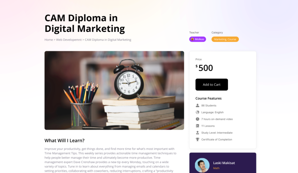
- Article or resource pages with clear layout, structured information, and strong readability.
- Visual identity tuned for an educational platform — soft color palette, readable typography, minimal and professional UI.
- Fully responsive design optimized for desktop, tablet, and mobile.
- Scalable UI/UX structure for adding future learning tools, blogs, and resource modules.
- Easy navigation to help users discover relevant content quickly.
Problem
Before the redesign, Osam Education had several issues:
- The content was not structured properly, making it hard for users to explore topics or find relevant information.
- The website lacked a clear visual identity, reducing trust and engagement.
- The user interface didn’t support smooth reading, causing high bounce rates.
- The site did not reflect Osam’s message: technology-driven self-education.
- Mobile experience was weak, leading to a poor learning experience on smaller screens.
- There was no clear framework to scale the platform with new categories or content types.
Solutions
- Conducted a content and UX audit to understand how users navigate learning materials.
- Designed a clean, structured UI system optimized for digital reading and long-form content consumption.
- Built a homepage focusing on storytelling — explaining the platform’s value, technology-driven learning, and self-development benefits.
- Organized educational resources into categories, helping users browse topics easily.
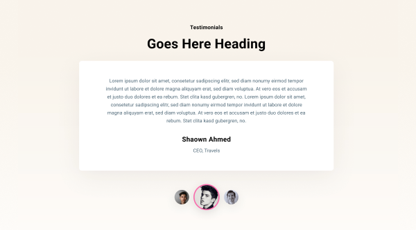
- Developed visually appealing article pages with improved typography, spacing, and content hierarchy.
- Implemented attention-focused reading layouts with better readability and user flow.
- Ensured the entire platform is mobile-optimized for learners accessing content on the go.
- Created a scalable design system so Osam can easily expand its content library, add new topics, or introduce interactive learning tools in the future.