Projects Overview
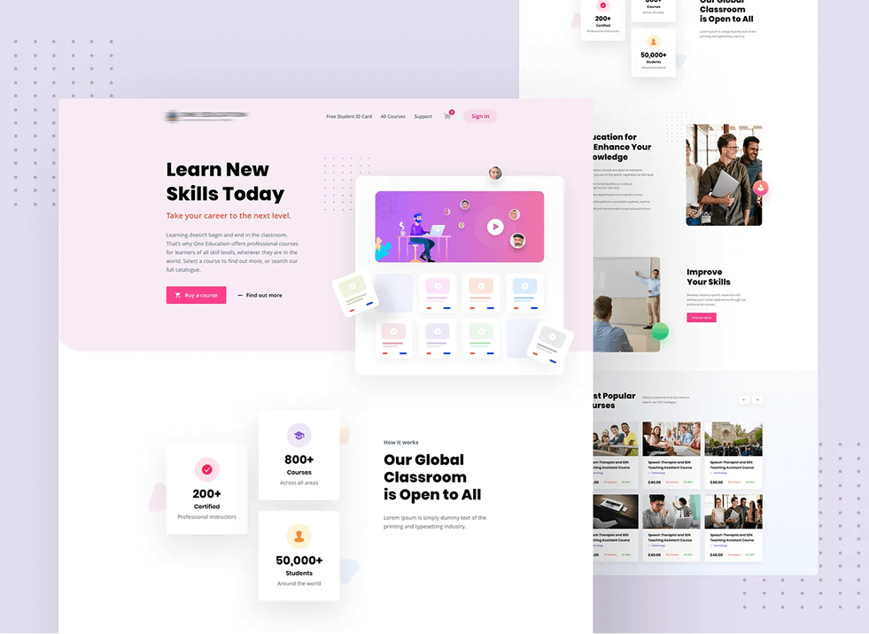
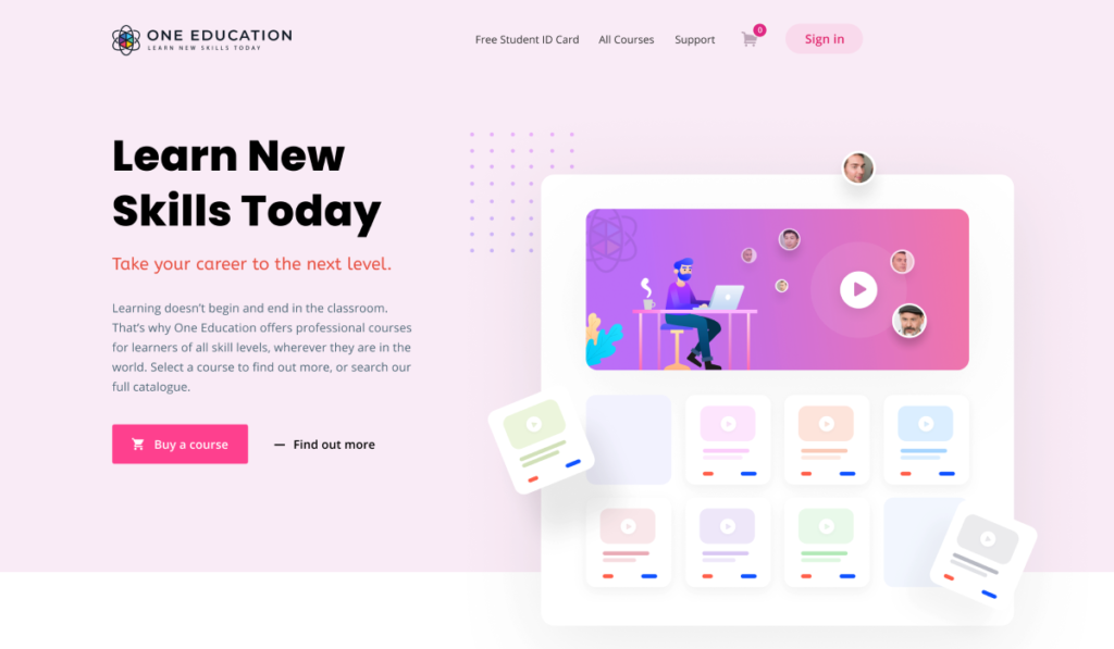
One Education is a global online learning platform offering professional courses for learners of all skill levels. Their mission is simple: “Learn New Skills Today. Take your career to the next level.”
They provide flexible, accessible, and career-focused courses to students across the world.
Doovisual was hired to redesign their entire website experience — creating a modern, intuitive learning platform that showcases their courses, improves navigation, and increases student enrollment.
Objectives
- Present One Education as a trusted, global online learning provider.
- Highlight the value of learning beyond the classroom with accessible, skill-focused courses.
- Improve the browsing experience so users can easily discover courses by category, skill level, or career path.
- Strengthen brand identity through clean, educational-focused UI/UX design.
- Increase course enrollment, user retention, and engagement through better UX, CTA placement, and content structure.
- Build a scalable design system that can support hundreds of courses and new upcoming features.
Requirements
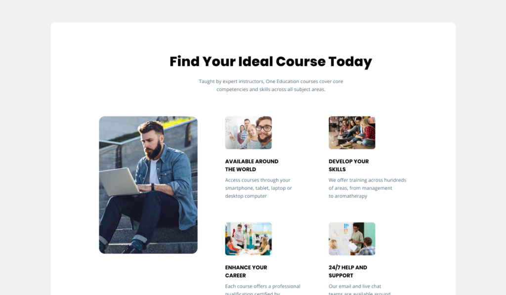
- A homepage introducing the platform’s purpose: “Learn New Skills Today. Take your career to the next level.”
- Course listing pages with filters, categories, search options, and clear pricing/enrollment information.
- Individual course detail pages including curriculum outline, instructor info, benefits, and enrollment CTA.
- A responsive design that works perfectly across desktop, tablet, and mobile.
- A professional, friendly visual identity aligned with education and e-learning standards.
- Integration-friendly design structure for LMS or custom learning dashboards.
- Future scalability for more courses, certifications, and student features.
Problem
Before the redesign, the One Education website faced several issues:
- The brand message and course value were not clearly communicated to users.
- The design lacked modern e-learning aesthetics, reducing trust and credibility.
- The course browsing experience was difficult — users took longer to find relevant courses.
- Course detail pages did not effectively convert visitors to students because of poor information layout.
- The website was not fully optimized for mobile users, which caused drop-offs and low engagement.
- The platform lacked structure for future expansion, limiting long-term growth.
Solutions
- Conducted a full UX audit to understand user behavior, course discovery patterns, and enrollment barriers.
- Developed a modern UI/UX system that reflects professionalism, clarity, and academic trust.
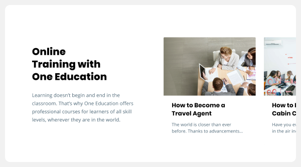
- Designed an improved homepage with strong hero messaging, featured courses, categories, and benefits of learning online.
- Built a scalable course catalogue with filters for category, skill level, price, and popularity — ensuring faster discovery.
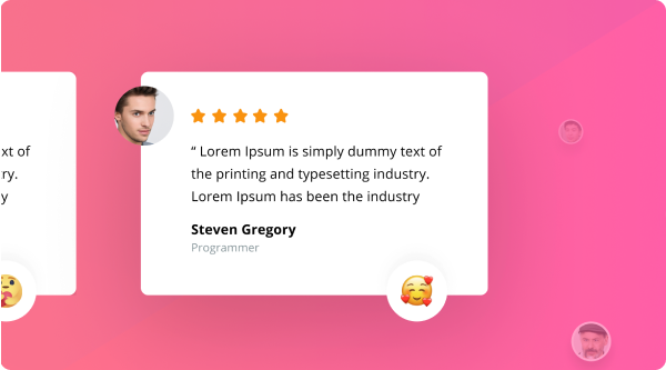
- Redesigned course detail pages with structured content: overview, learning outcomes, curriculum, instructor details, reviews, and enrollment CTA.
- Ensured the website is fully responsive and mobile-optimized for global learners.
- Strengthened visual branding through consistent typography, color patterns, and educational iconography.
- Created a scalable layout that supports future features such as dashboards, certificates, quizzes, and advanced LMS integration.