Most startups think of a brand style guide as something you create once branding is “done.” A PDF that lives in a folder. A checklist of logos, colors, and fonts that designers might reference occasionally.
That perception is exactly why most style guides fail.
In reality, a brand style guide is not documentation. It is decision infrastructure. It exists to reduce ambiguity, speed up execution, and keep a growing team aligned as the product, marketing, and brand evolve.
After years of working with startups and SaaS teams, the pattern is clear: companies that delay creating a proper brand style guide don’t move faster. They move sloppier. They repeat the same conversations, fix the same inconsistencies, and slowly dilute their brand without realizing it.
This guide explains how to build a brand style guide that actually gets used—and why doing it early pays dividends long after launch.
What a Brand Style Guide Really Is (And What It Isn’t)
A brand style guide is often misunderstood as a visual artifact. Logos. Hex codes. Font names.
Those are components, not the system.
A real brand style guide answers a deeper set of questions:
- How should this brand feel in different contexts?
- How do we express consistency without rigidity?
- How do different teams make decisions without reinventing the brand every time?
In modern startups, especially SaaS, branding touches more surfaces than ever before. Website pages, product UI, emails, onboarding flows, sales decks, social content, support documentation—all of these are brand touchpoints.
Without a shared system, each team fills in the gaps based on personal taste or urgency. Over time, the brand fractures.
A style guide exists to prevent that fragmentation.
Why Startups Usually Delay Style Guides (And Why That Backfires)
Founders often postpone creating a style guide for practical reasons. Early teams are small. Everyone talks to everyone. Decisions happen fast.
The assumption is: “We don’t need rules yet.”
That assumption breaks the moment:
- A second designer joins
- Marketing output increases
- External partners get involved
- Product UI expands
At that point, the absence of a style guide creates friction. Designers make different choices. Marketers improvise visuals. Developers implement UI inconsistently. The brand slowly loses coherence.
What’s ironic is that teams often respond by tightening control—more reviews, more approvals, more meetings. A good style guide would have prevented the need for all of that.
The Real Cost of Inconsistent Branding
Inconsistent branding doesn’t usually cause immediate failure. It causes drag.
From experience auditing startup design systems, inconsistency often shows up as:
- Slightly different shades of the same color
- Multiple font sizes doing the same job
- Buttons that look similar but behave differently
- Copy that shifts tone depending on the author
Individually, these issues seem minor. Collectively, they increase cognitive load for users and slow down internal execution.
Users may not articulate the problem, but they feel it. The product feels less polished. The company feels less confident. Trust erodes subtly.
A brand style guide is not about aesthetics. It is about reducing friction, internally and externally.
Why SaaS and Digital Products Need Style Guides Earlier
For SaaS startups, style guides are even more critical.
Unlike traditional brands, SaaS companies don’t just market—they deliver value through interfaces. The product itself is a brand expression.
Without a style guide:
- Product UI drifts from marketing promises
- Onboarding flows feel disconnected from the website
- New features introduce visual and tonal inconsistency
This disconnect hurts adoption. Users struggle to orient themselves. The experience feels stitched together rather than intentional.
Strong SaaS brands avoid this by treating the style guide as a bridge between brand and product UX.
This is where agencies like Doovisual focus their effort- helping startups build style guides that work across website, product UI, and growth channels instead of living in isolation.
Style Guides as a Tool for Speed, Not Control
One of the biggest misconceptions is that style guides slow creativity.
In practice, the opposite is true.
When teams don’t have guidelines, they spend time debating basics:
- Which color should we use here?
- Is this headline on-brand?
- Should this button look different?
A good style guide removes these decisions from day-to-day work. Designers and marketers can focus on solving real problems instead of re-litigating fundamentals.
This is especially important in fast-moving startups, where speed matters more than perfection.
Style guides don’t eliminate creativity. They channel it.
The Difference Between a Style Guide and a Design System
These terms are often used interchangeably, but they are not the same.
A brand style guide defines:
- Brand foundations
- Visual and tonal rules
- Principles for consistency
A design system extends this into:
- Reusable UI components
- Interaction patterns
- Technical implementation guidelines
Startups don’t always need a full design system early on. But they almost always need a style guide.
Think of the style guide as the why and how, and the design system as the what.
Without the former, the latter becomes mechanical and inconsistent.
Why “We’ll Just Be Consistent” Doesn’t Work
Many teams assume consistency will happen naturally.
It rarely does.
Consistency requires:
- Shared understanding
- Documented decisions
- Easy reference points
Without these, people default to what’s fastest. Over time, the brand becomes a patchwork of good intentions.
A style guide externalizes decisions so teams don’t rely on memory, personal taste, or institutional knowledge. This becomes critical as teams grow and turnover happens.
The Long-Term Value of a Living Style Guide
The most effective style guides are not static PDFs. They are living systems.
They evolve as:
- The product matures
- The audience becomes clearer
- The brand position sharpens
Early versions don’t need to be perfect. They need to be usable.
Startups that treat their style guide as a living document avoid painful rebrands later. Instead of resetting everything, they evolve gradually, preserving trust and recognition.
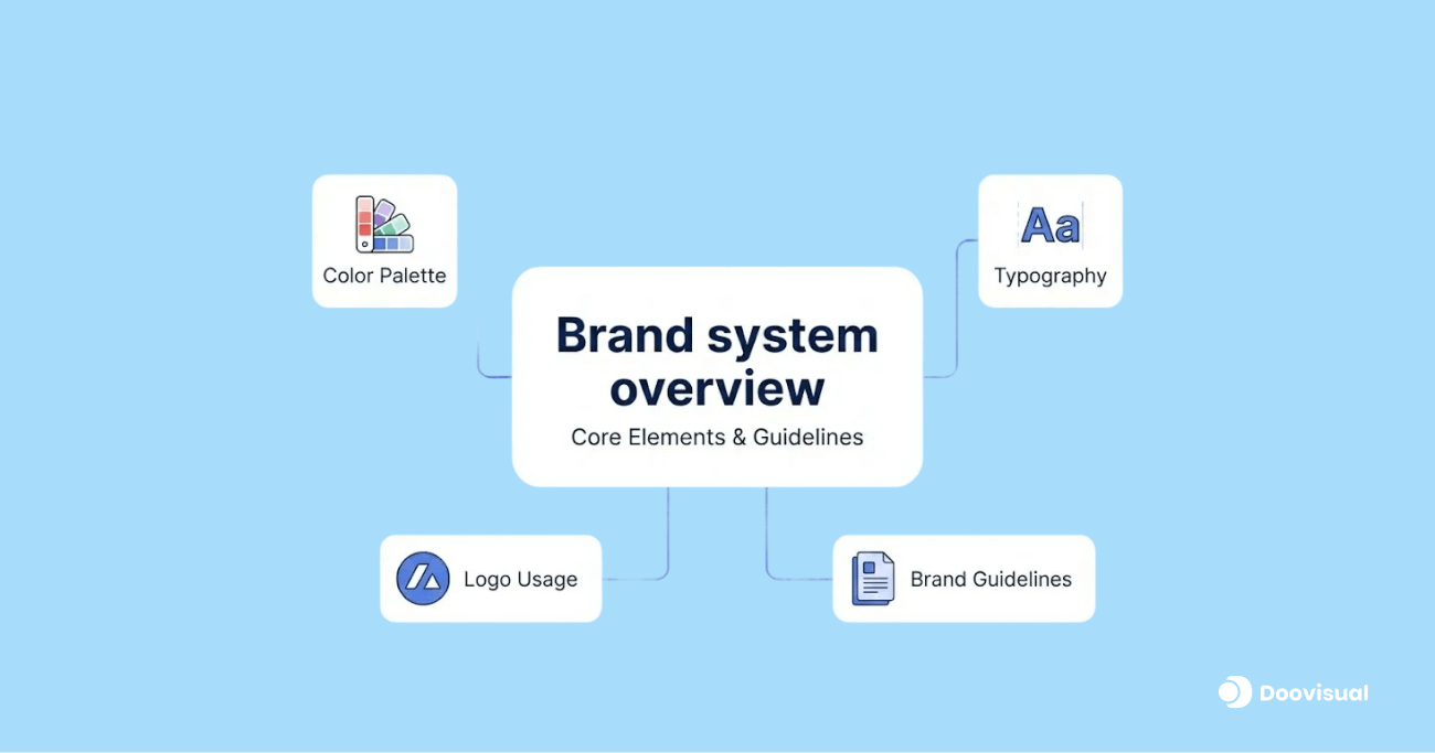
The Core Elements Every Brand Style Guide Needs (And Why)
A useful brand style guide is not exhaustive. It is decisive.
The goal is not to document everything, but to document the things that prevent confusion and slow execution.
Brand Foundations: The Part Most Teams Skip (and Regret)
Before colors and fonts, a style guide needs to establish brand intent.
This includes:
- Brand purpose and positioning
- Target audience definition
- Brand personality and tone
Many teams assume this lives elsewhere. In reality, when it’s missing from the style guide, designers and marketers make different assumptions. That divergence shows up as inconsistent messaging and UX decisions.
Research in brand consistency shows that companies with clearly defined brand guidelines are 3–4x more likely to maintain consistent customer experiences across channels. Consistency is not accidental; it’s documented.
For SaaS teams especially, this foundation helps ensure that:
- Product copy matches marketing language
- Onboarding flows reflect brand values
- Support communication feels aligned with the product
Without this layer, visual rules feel arbitrary.
Logo Usage: Less About Rules, More About Protection
Most style guides include logo sections. Most logo sections are ignored.
The problem is not inclusion, but framing. Logo rules should exist to protect clarity, not enforce rigidity.
A good style guide explains:
- Where the logo adds value
- Where it creates noise
- How spacing and sizing preserve legibility
Inconsistent logo usage rarely destroys a brand overnight. What it does is erode professionalism over time—especially when assets are reused across decks, landing pages, and partner materials.
Clear logo guidelines reduce back-and-forth and prevent misuse when teams scale or external vendors get involved.
Color Systems: Why One Palette Is Never Enough
Many startups document a single color palette and call it done.
In practice, digital products need color systems, not just palettes.
This means defining:
- Primary brand colors
- Secondary and accent colors
- Functional colors (success, warning, error)
Why this matters: usability.
Accessibility studies show that over 70% of accessibility issues in digital products are related to color contrast. When teams improvise colors without guidance, accessibility suffers, and so does UX quality.
A strong style guide explains how colors behave across:
- Marketing pages
- Product UI
- Data visualization
- States and feedback
This prevents random choices that undermine usability and brand cohesion at the same time.
Typography: Consistency That Improves Readability
Typography decisions influence far more than aesthetics. They directly affect readability, scannability, and comprehension.
Studies on web readability consistently show that clear typographic hierarchy improves task completion speed and reduces cognitive load. In SaaS products, this translates into faster onboarding and better feature discovery.
A usable style guide defines:
- Font families and weights
- Hierarchy rules (headlines, body, captions)
- Usage guidance, not just font names
Without this, teams default to what “looks right” in the moment. Over time, interfaces become noisy and uneven.
Typography rules are one of the fastest ways to improve perceived quality without changing functionality.
Tone of Voice: Where Most Style Guides Are Vague
Tone of voice sections are often aspirational but unusable. Words like “friendly,” “bold,” or “human” sound good but don’t guide decisions.
Effective style guides translate tone into behavior:
- How do we explain complex ideas?
- How do we speak in error states?
- How do we address users directly?
In SaaS, microcopy matters. Empty states, loading messages, and errors shape emotional responses during moments of friction.
Research on UX writing shows that clear, empathetic microcopy can reduce user frustration and improve task completion rates—especially during errors or onboarding.
Tone guidelines help ensure that these moments reinforce trust rather than undermine it.
UI Principles: Bridging Brand and Product
This is where many style guides stop short.
For SaaS startups, it’s critical to include high-level UI principles:
- How much visual density is acceptable?
- How do we balance simplicity vs power?
- How do we guide attention?
These principles don’t replace a design system, but they inform decisions when components don’t yet exist.
Without them, product UX drifts away from brand intent as features are added quickly.
This is one reason why startups working with partners like Doovisual often include UI principles in their style guides—to keep brand and product aligned even as velocity increases.
How Teams Actually Use a Style Guide (When It Works)
A style guide succeeds when it is referenced, not admired.
In practice, strong teams use it to:
- Resolve debates quickly
- Onboard new hires faster
- Align external partners
- Maintain consistency without micromanagement
Data from internal design ops studies shows that teams with documented design and brand guidelines spend less time on reviews and revisions, because expectations are clear upfront.
When style guides fail, it’s usually because:
- They are too long
- They are too abstract
- They live in the wrong place
Usability applies to internal tools too.
Common Mistakes That Make Style Guides Useless
One of the most common mistakes is over-documentation. Teams try to capture every possible scenario. The guide becomes overwhelming, outdated, and ignored.
Another mistake is treating the style guide as a static deliverable. Brands evolve. Products change. A frozen guide quickly becomes irrelevant.
Finally, many teams separate branding from product reality. The guide looks great, but doesn’t reflect how the product actually works. That gap ensures it won’t be used.
The best style guides are:
- Opinionated
- Lightweight
- Easy to update
They prioritize decision-making over completeness.
Stats That Explain Why Style Guides Matter at Scale
A few relevant benchmarks worth keeping in mind:
- Brands with consistent presentation across platforms see up to 20% higher revenue compared to inconsistent brands (brand consistency studies).
- Teams with shared design guidelines reduce design-related rework by 30–40%, based on internal design ops benchmarks.
- Faster onboarding of new designers and marketers is consistently reported when style guides exist, reducing ramp-up time by weeks in growing teams.
These gains are not flashy, but they compound over time.
Real Startup Scenarios Where Style Guides Prevent Costly Mistakes
Scenario 1: Hiring Scales Faster Than Brand Clarity
A startup grows from 8 people to 25 in under a year. New designers, marketers, and developers join quickly. Everyone is talented. Everyone moves fast.
Without a style guide, decisions fragment. One designer interprets the brand as minimal and restrained. Another pushes expressive visuals. Marketing copy shifts tone depending on who writes it. Product UI starts drifting from the website.
Nothing is “wrong” enough to trigger an emergency, but cohesion disappears.
Teams with a clear brand style guide avoid this. New hires ramp faster because expectations are explicit. Decisions feel aligned without constant oversight. The guide acts as shared context, not control.
This is why internal studies across growing teams consistently show that documented brand and design guidelines reduce onboarding friction and speed up execution—often saving weeks per hire.
Scenario 2: External Partners Enter the Picture
The moment a startup works with freelancers, agencies, or contractors, brand inconsistency accelerates.
External teams don’t have historical context. They rely entirely on what’s documented. Without a style guide, they guess—and those guesses vary.
A clear style guide ensures:
- External work aligns with internal standards
- Review cycles shorten
- Less time is spent “fixing” instead of building
This is one of the fastest ROI moments for a style guide. Even a lightweight version prevents rework that costs more than the guide itself.
Scenario 3: Product Evolves, Brand Doesn’t
As SaaS products mature, complexity increases. New features introduce new UI patterns. Without guidance, these patterns diverge.
A style guide with UI principles acts as a stabilizer. It doesn’t dictate every component, but it anchors decisions. The product evolves without losing its identity.
Teams that skip this often face a painful realization later: the brand and product no longer feel like the same company.
A Practical Framework to Build Your First Style Guide (Without Overengineering)
Most teams fail because they try to build the perfect style guide. You don’t need perfect. You need usable.
Here’s a pragmatic approach that works for startups.
Start by documenting decisions you already make repeatedly. If a question comes up more than twice, it belongs in the style guide.
Focus first on:
- Brand intent and audience clarity
- Visual foundations (logo, color system, typography)
- Tone of voice principles
- High-level UI guidelines
This first version does not need to cover every scenario. It needs to remove ambiguity in the most common ones.
Treat the guide as versioned. v1 is allowed to be incomplete. v1 just needs to exist.
How to Keep a Style Guide Alive
The biggest risk after creating a style guide is letting it go stale.
Living style guides share a few traits:
- They are easy to update
- They are referenced in workflows
- Ownership is clear
Style guides die when no one feels responsible for them. Assign ownership—not to police usage, but to evolve it alongside the product and brand.
In high-performing teams, style guides are revisited during:
- Product shifts
- Rebrands or repositioning
- Growth inflection points
This prevents the need for disruptive overhauls later.
Where Most Teams Go Wrong (Even With a Style Guide)
One common mistake is treating the guide as law rather than guidance. When teams feel constrained, they stop using it.
Another mistake is separating brand from reality. If the guide doesn’t reflect how the product actually behaves, it will be ignored.
Finally, many teams hide the style guide. If it’s hard to find, it won’t be used. Accessibility matters internally just as much as externally.
The best guides are opinionated, realistic, and easy to reference.
Why Style Guides Compound in Value Over Time
The value of a brand style guide is not linear.
At first, it saves small amounts of time. Fewer debates. Faster decisions. Cleaner outputs.
Over time, those savings compound:
- Brand trust strengthens
- UX consistency improves
- Teams align faster
- Rebrands become evolutions, not resets
This compounding effect is why mature SaaS companies invest heavily in design systems and brand governance. The style guide is the foundation that makes that possible.
Teams working with partners like Doovisual often discover that the biggest benefit of a style guide is not visual consistency—it’s organizational clarity.
Final Conclusion: A Style Guide Is How Startups Scale Without Losing Themselves
In 2026, startups move faster than ever. Speed without alignment creates chaos. Alignment without speed creates stagnation.
A brand style guide exists to balance both.
It allows teams to move quickly without reinventing the brand every time. It protects clarity as the company grows. It turns branding from a subjective discussion into a shared system.
If your brand lives across a website, a product, emails, decks, and campaigns, it deserves a single source of truth.
Build a style guide early. Keep it practical. Let it evolve. Your future team will thank you.