Projects Overview
TakeUI is a modern design-asset marketplace where creators and developers can purchase high-quality UI components, templates, illustrations, and design files to use in their personal or commercial website projects. The brand required a visually engaging and conversion-focused website that clearly communicates its value: premium, ready-to-use design assets that save time and elevate quality.
Doovisual was responsible for the full website design, UX architecture, interface system, and overall digital branding.

Objectives
Build a strong digital presence that positions TakeUI as a reliable and premium design-asset marketplace.
Create a modern, minimal, and highly visual UI to showcase design products effectively.
Develop an intuitive browsing and purchasing experience for users looking for UI kits, templates, and digital assets.
Increase user trust through clean navigation, clear product categorization, and smooth checkout flow.
Ensure the website supports future scalability for new asset categories, creators, and marketing campaigns.
Requirements
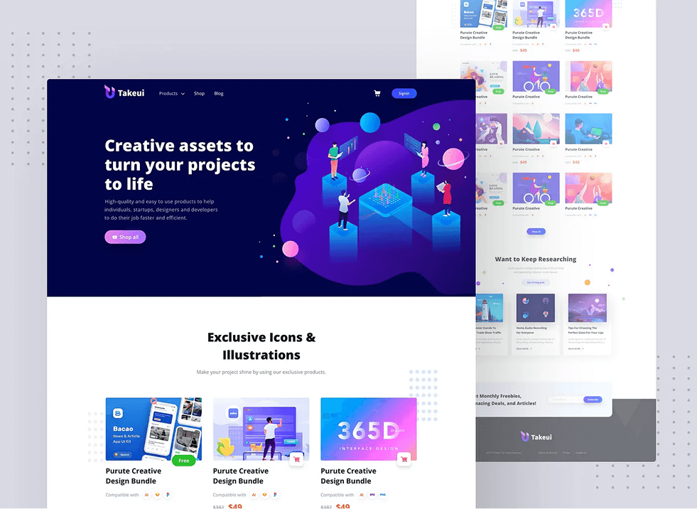
- A modular homepage showcasing trending products, categories, best-selling assets, and promotional sections.
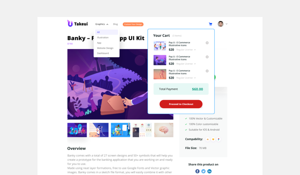
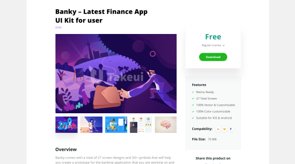
- Individual product detail pages with previews, features, licensing options, version updates, and download information.
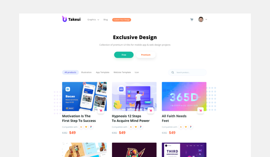
- A filtering and categorization system (UI Kits, Dashboard Templates, Components, Icons, Illustrations, etc.).
- A design language aligned with modern product-design standards — clean typography, minimal spacing, and premium visuals.
- Fully responsive layouts optimized for mobile, tablet, and desktop.
- A structure that supports future upgrades like creator profiles, multi-vendor systems, blog, and marketing tools.
Problem
Before the redesign, TakeUI lacked a strong visual identity and a structured presentation of its digital products. The previous layout made it difficult for users to quickly discover relevant items or understand the value of each asset. Product previews were not showcased effectively, and the purchase journey lacked clarity—leading to reduced engagement and conversions. Overall, the brand needed a more refined, professional presence to compete with modern design marketplaces.
Solutions
- Conducted a UX strategy workshop to map user journeys for designers, developers, and agency buyers.
- Created a clean, modern UI design system that highlights product previews, thumbnails, and live-demo links.
- Reorganized information architecture to make browsing effortless through categories, filter sections, and featured collections.
- Designed high-conversion product detail pages with detailed descriptions, feature breakdowns, screenshots, licensing options, and FAQs.
- Implemented a visual-first homepage with strong hero messaging, highlighted collections, and trust-building elements.
- Ensured optimized responsiveness, fast performance, and intuitive navigation across all devices.
- Prepared a scalable layout that can expand into new categories, partner marketplaces, blog resources, and future creator profiles.